The Science Punk blog has a list of iconic science images that are inaccurate or flat out wrong. My favorite is the map of the Earth.
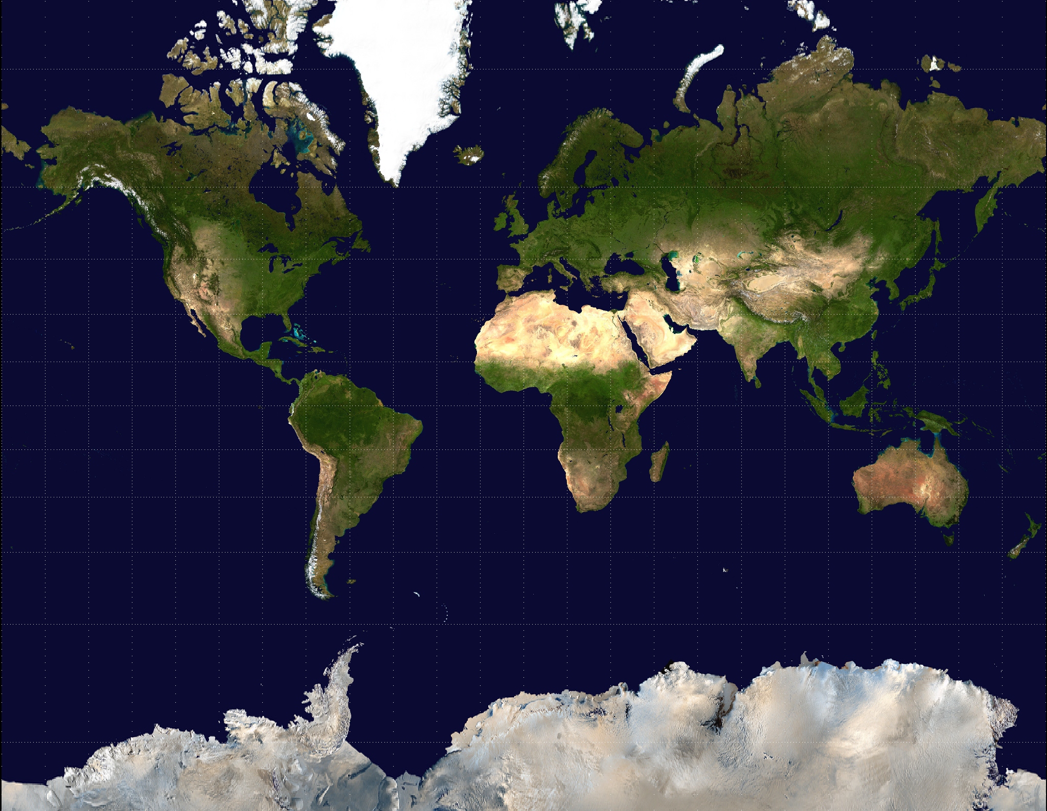
Most of us are used to the following picture.

However, the Mercator Projection above is only one way in which the surface of a sphere can be represented on a flat piece of paper, and it's not necessarily the best way. Notice that Greenland appears to be about the same size as Africa, when in fact it's about 15 times smaller.
Now take a look at the Gall-Peters projection. It's still not as accurate as a globe, but it looks completely different. And there are other projections as well.
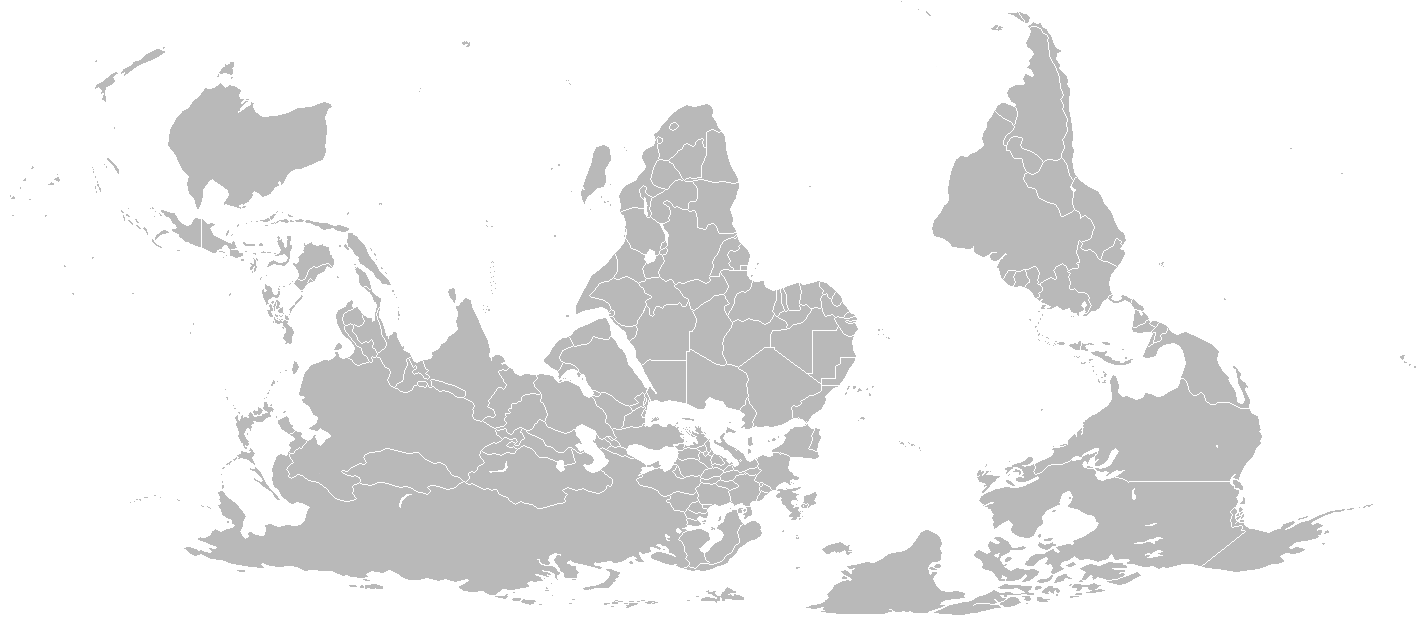
Check out the following two representations.
Hat tip: Not Exactly Rocket Science.


No comments:
Post a Comment