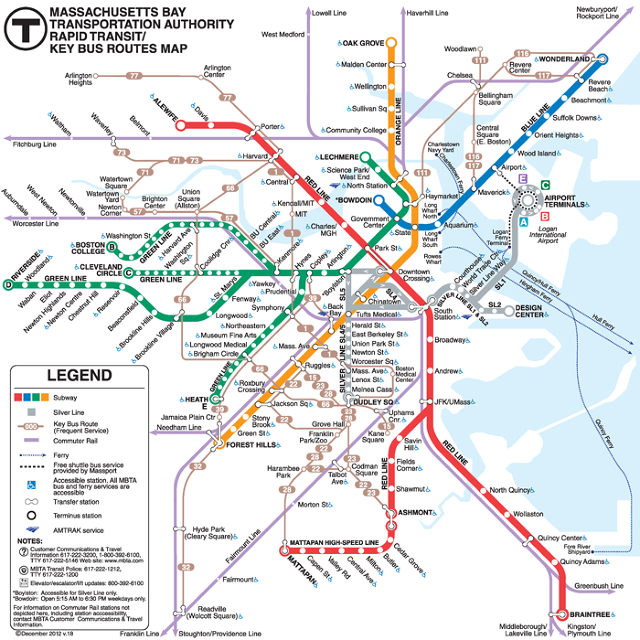
Recently, the Massachusetts Bay Transportation Authority (MBTA) held a contest to redesign their current subway map:
And this was the contest winner:

It's based on the gold standard of subway map beauty and functionality, the Vignelli New York City subway map of the 1970's:
 |
| Massimo Vignelli’s 1972 NYC subway map uses geographic distortions to accommodate subway lines |
You can read more about the science that goes into subway map design here and here.
No comments:
Post a Comment